Question 3: Do you prefer horror films to other genres?
I had 100% response saying that no they didn't.
Question 4: Why don't you watch horror films?
I had 100% response with "I would prefer to watch something else"
Question 6: Why do you prefer this genre?
Comedy: Because its not scary
Action Comedy: It interests me
Drama: I get too scared in horror films.
Question 7: Would you consider watching a horror film?
100% response yes
Question8: If you answered yes to the previous question, what would make you watch a horror film?
Participant 1: Peers
Participant 2. The plot
Participant 3. Cast or type of horror.
Although i didn't get many people answering my questionnaire it is clear that there is a gap in the market for a psychological horror film. And although all of my participants said that they did not watch horror films they all did say that they would consider watching a horror film.
Whilst filming our trailer we had to get permission to film in some of the locations. For scenes of the film where in public locations there-fore we did not need to get permission to film there. We did however need to get permission off
Costa Coffee The house owner The reverend at the graveyard
To film our trailer we had to get permission for some of our locations, the locations which we did not have to get from was the alleyway scence as this is public property.
we did get permission from;
Trainstation(Merseyrail)
We asked the attendent that was duty if it was ok for us to film she gave us verbal permission on the basis that we did not film any passengers of Merseytravel.
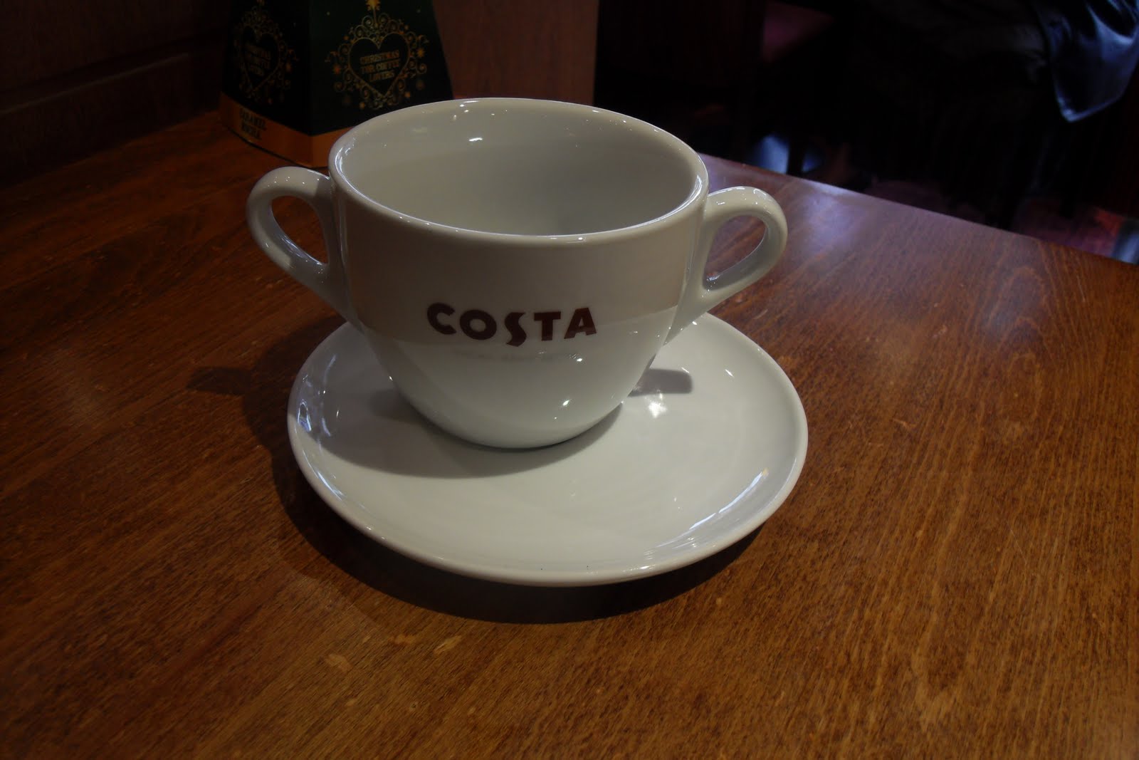
Costa coffee
The House scene
Fortunately for us we filmed this scene in one of the members of our groups house so she asked her parents and they gave us the permission to film in any room of the house.
Graveyard
A member of our group sent an email to the reverend to see if we would be aloud to film in the graveyard he gave us permission.
As you can see from looking at the Filming Log compared to the Production schedule you can see that there are differences and similarities. The first difference being the dates which we intended on filming on all of our group became unavailable to film on at different times. Also all of the members of our group weren't able to film on the same day but we all attended at least on of the filming days, and all did different aspects during the filming. As you can see from the final column we also didn't use all of the scenes and the ones which we did and did not use are clearly stated.
We decided as a group a number of different locations to shoot for our A Level film trailer.
Grave yard
Our first location was St Andrews Church in Maghull, this was an ideal location as it is dark, erie atmosphere fitted in with the theme of out trailer 'Psychological Horror' In order for us to legally be allowed to film in this locat there we needed permission from the Church Parish. A member from our group sent an email explaining the reason we needed to film there and what were filming. We got a response allowing us to film there.
Cafe
Our second Location was the Costa Coffee in Ormskirk. for a scene in our trailer we needed to use a cafe we chose Costa Coffee in Ormskirk as it is a quite area so we knew that we wouldnt be interupting anybody, and the style of the cafe fitted in with what we were looking for. Again we were legally required to gain permission to film there, we spoke to the manager of the cafe and she gave us permission to film there, she was also happy to sigh our contributor's release form.
Train Station
Our third location was Maghull train station we chose this trainstation as it was in our area, it also fitted in with the style that we were looking for. We asked the attendent that was duty if it was ok for us to film she gave us verbal permission on the basis that we did not film any passengers of Merseytravel.
House
Our forth location was one of the members of our groups house. This was perfect for what we needed as she had a long hallway attached to the kitchen ideal for a key scene in our trailer and the perfect sized, spaced bathroom. We gained permission from her herself and also by her parents who signed a contributor's release form.
Alleyway
Another location was an Alleyway in Maghull. This was perfect as it fitted in with the style of our trailer it was dark, cold and mysterious. We did not need permission from anyone as it is public property.
Field
We also chose the Field/park for another part of our trailer we felt that this fitted in with the happy, warm, friendly theme we were going for in part of our trailer. We didn't need permission to film in this location as it is public property.
House 2
We used this location for the physiatrist part of our scene we felt that the location was perfect. We gained permission for the filming from the the girl's who house it was and who was also part of our team.
Country Lane
We used this location as we felt that the dark, creepy, coldness of the road and open spaces fitted with the theme that we were going for. We didn't need permission to film in this location as it is public property.
The choice for our costumes had alot to do with the target audience for our trailer. we decided on simple costumes that told the audience what type of character they were. We made sure that the costumes fitted in with the style of today and that they were practical.
This is the costume for the graveyard scene this outfit fitted in with the atmosphere which we were trying to create, as it was a funeral all black was appropriate we thought;
This costume was used for our extra we decided on this as she was supposed to be a lawyer;
this costume was used for our other extra we decided on this as it fitted in with the character she was playing a friend of our main actor;
For the soundtrack of our trailer we have chosen Christopher Young- The Grudge (original motion picture soundtrack). The reason why we chose this piece of music was we felt that in fitted in with the theme of our trailer. The eerie, cynical tone of the music emphasises the style of a physiological horror film. with the soundtrack being quite low in parts we are able to fit this in were speech is used.
)
After much debating and putting the soundtrack onto our film we decided that the music we had chosen didn't fit in with the theme or style that we wanted to put across we thought that the music we chose didn't flow as well as we first anticipated.
hHere is the our final choice for our soundtrack "28 weeks later"
I have created a questionnaire to see if the sub genre our group chose was the right choice. I would be very grateful if you could fill it in. Thank you :) You can get to it by clicking here.
Below is a copy of the storyboard for our film trailer, which we came up with together as a group. Having a story board is ideal as we are able to find out and plan what we need for our trailer to run smoothly. If we stick to our story board when filming then the process of filming then our project will be easier to film and when we eventually edit.
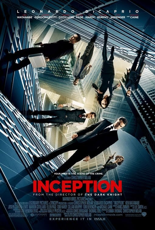
When looking at The Grudge poster (poster one) it is quite simple yet effective. The image of the girls eye gives the idea that she is looking straight into the camera, engaging to us as the audience almost as if she is watching us. It conveys the image and the stereotype of horror very effectively its intense and frightening, the image is shot in a dark light with strong black eye makeup on which is the only part of her face which is shown. This adds mystery and darkness to the image . Sarah Michelle Gellar’s the main actress in the film is printed above the headline this is a good sell line as she is a well known actress which will attract an audience to watch the film. The headline of “The Grudge” is printed in thick red writing the colour conveys blood, danger and anger towards us as the audience. The text looks rough which reflects the genre of the film, it also stands out on the black background. There is a tagline at the bottom of the poster which reads “It never forgives. It never forgets”, this creates enigma about the film but also links it to the film trailer as these lines are also shown. The release month of the film is printed in large red font which stands out from the rest of the text and also links in with the headline “The Grudge”. The month of which the film is released is quite significant as it is released in October which is not only the same month as Halloween but also the same month as half term from looking at the poster I think that it is aimed late teens. But will appeal to both boys and girls.
Poster Two
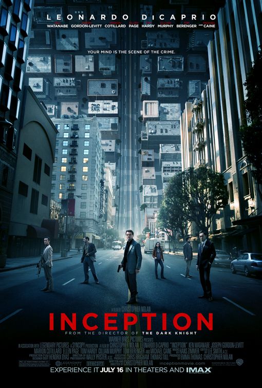
In this poster the Headline again is in deep red which gives the image of smeared blood. The image or images are different from the first poster one is of the a female character which i presume is the main character. She seems to be looking in a mirror and in the background you can see “the thing” or “the Grudge”, again her skin is pale and dirty her eyes seem to be covered by her hair, the face seems to be in pain this gives us an insight into what the film is about. The other is off what looks like an old house it is quite dirty and warn it looks eeire as though something isn’t right there. It conveys an image of horror. Sarah Michelle Gellar’s name is again above in bold writing and in a place where it is ease ably seen. The release date of the film is not shown on the poster.
The Grudge film trailer starts with Sarah Michelle Gellar introducing the film, this is unusual of film trailers. We then get a state of equilibrium as we get and image of a busy city on a sunny day, with people doing their normal day to day routines and everything seems to be “normal” and “happy”. But with the deep whistling non digetic sound in the background builds tension giving us as the audience a slight clue that everything might not be as it seems. When we are introduced to the first female character the lighting is very dim giving us a sense of danger horror which creates and uneasiness, she seems to be looking at the ceiling after hearing a strange sound, this creates an enigma as it gets us asking questions about what is happening. The positioning of the camera represents the female character as being vulnerable, this is typical of a horror film. Throughout the film trailer text fades in and out giving us as the audience an insight into what is happening, yet it still makes you ask questions “when someone dies”.... “a curse is left behind” this indicates evil something strange. The text is shown on a misty white background creating an eeire atmosphere. The colour scheme of the text is dark blue/black which represents the horror genre well, as black tends to represent darkness and death. The colour scheme is the same throughout the trailer. The next character we see is another female she has long blonde hair and is unfamiliar with her surroundings stereotypical of a horror film. The digetic sound of her voice saying “the whole time I was in the house, I felt something was wrong” as we know that she is in a house where there is something strange happening. Behind her we then see a shadow quickly passing by, which looks like a girl with long black hair her identity isn’t revealed also typical of a horror film. This builds tension. With the constant flashing in and out of darkness adds to the terror and tension of the trailer, the screams and loud screeching noises also adds to this. The expression of the woman’s face becomes more fearful and as more things begin to happen. This starts to show her in a state of panic. We then see more text “it never forgives” and “it never forgets” this creates alot of enigmas for the audience making them want to go and see the film. The music in the background becomes louder and more rapid rising the tension. We see abnormal behavior by a Chinese girl who is shown throughout the trailer, we see her climbing down the stairs on her hands and knees with them bent in strange places her skin is very pale and dirty. And she seems to have blood on her face. This adds to the horror of the trailer. The film trailer ends with what seems to be a purple hand emerging out of the back of the women’s head while she is in the shower, this could mean that the “curse” may be on her know. The title of the film is shown in bold white writing with the music reaching a climax.
In our group we decided to create a psychological horror film trailer. A ipsychological horror s a sub horror genre.
They are usually more subtle compared to traditional horror and typically contains less physical harm, as it works mainly on the factors of mentally affecting the audience rather than the display of graphic imagery. They reli on character fears, guilt, beliefs. This is done using eerie sound effects, relevant music and emotional instability to build tension.
Films within the psychological horror genre include;
The grudge Paranormal activity The omen The Sixth Sence The Ring etc
"Movie trailers play an increasingly important role in entertaining us and helping us determine where to spend our leisure time. The best trailers are works of art in their own right, expertly blending elements of cinema and advertising."
The Golden Trailer Awards is devoted to feature film previews, it celebrates the craftsmanship that goes into making these potent mini-epics,to recognize the creative people who make the trailers to show their unique art, in a gala award show. The awards occur every May awarding achievements in Motion Picture Marketing, the awards are given out for trailers, film posters and television advertisements. The awards are an open competition which is judged by film industry notables.
It lasts for 90mins and consists of 16 categories some of which include;
Best Comedy Best Independent Trailer Best Video Game Trailer Trashiest Trailer Best Foreign Action Trailer Best Documentary Poster
Movie Trailers first appeared in cinemas in 1913 with Nils Granlund's short promotional film "The Pleasure seekers". During the 1950's most trailers were created by the National Screen Service they were made up of big fonts loud music limited shots and stentorian voice overs advertising the film. An example of this is the origanl 1950's film trailer Cinderella.
The Inception trailers are made up of Medium Long Shots, Medium Shots, Close ups and montage shots. There is also alot of jump cuts to quicken the tempo of the trailer. The fade to black shot gives the trailer a more era feel.
The Inception teaser trailer was released for the film which is due to be realised soon. The idea of the trailer is to create enigmas about the film. This is done by using alot of jump cuts giving us as an audience a vague view of what the characters are like and key events. Usually in a teaser trailer dialogue isn’t generally used but a definite sound track is used in the background. When trying to define the genre from the trailer it is clear that there is a clear overlap of genres thriller, action adventure with a hint of science fiction. The trailer starts off showing the Warner Bros Logo is portrayed as an ariel view of the city inside the outer rim of the logo, this could show that maybe the city is confined in our minds. We see an ariel shot of the city this could possibly be an establishing shot or a point of view shot, this shot could be important because it is the only shot with a readable sign on a building this being ‘Mitsui Garden Hotel’ this may be the hotel hallway that is shown later in the trailer. A class of water is shown on a wooden table this might not be significant apart from the fact that the table and class are completely still, but the water in the class is tilting to one side. This may be linking into the hallway fight we see next the idea of shifting properties. The text “YOUR MIND” is positioned in the centre of buildings which quickly rotates with the cityscape again the architecture is a big part in this scene. The next card we see says "IS THE SCENE OF THE CRIME" but here, the buildings actually seem to be moving, most evident at the tail of this shot. The hallway scenes seem as though the characters are falling the fight continues as the room's perspective shifts, taking them along the walls. This time the opponents seem to have changed, the cart in the background; it seems to be falling up. The trailer ends with the film title being shown its starts off as a skyline shot of a city before becoming the "Inception" logo. This again links in with my first idea that architecture plays a huge part in the film and that there may be an alternative reality within the human mind.
Here in the second trailer we start with the Warner Bros logo but this time it is portrayed as if we are going through the city this is further emphasis on the idea of the city as a maze. Again water plays a huge part in this trailer.As does aritexture the scene with the city curving over gives the implication that either the idea that the mind can effect the landscape around us. The interesting part about this scene is that when looking closely the even though the portion of the city that is curved the vehicles and people there are not adhering to the rules of gravity. The scene in the hotel tells also shows us that everything isn't as it seems we see three men fighting as in the teaser trailer the room's perspective shifts but this time instead of taking them along the walls they are falling down.
When conducting my research and planning i looked at the Inception posters:
Poster one
Poster two
Poster three
In all three posters architecture is the main theme. The tall buildings give the image of the characters being closed in on, a sense of being trapped. The tagline is also recognisable in all three posters "your mind is the scene of the crime". The use of the word "EXPERIENCE" on all three draws the reader in. Also when looking at all three poster we can see in the middle a yellow light this gives me the idea of 'light at the end of the tunnel' that the characters are in trying to work towards something a way out. All three posters seem to have a blue screen over the original image, this is a common theme for Christopher Nolan's films.
The water shown in poster one is known as intertextuality, it seems out of place as though it is supposed to be somewhere else, it seems as though it should be in "The Day After Tomorrow". This poster seems familiar though it looks like the "Dark Knight" poster.
From looking at the inception, and the Dark Knight poster they are clear examples of intertextuality within Warner Brothers posters. This is potentially down to Auteur Theory with both films being directed by Christopher Nolan he has his own personal vision, thematic obsession and a signature style. when looking at all three posters (Inception, Dark Knight and Watchman) it is clear that they are all part of the Warner Bros production company. They all show the vast, wet cityscape. The figures (Cobb- Leonardo DiCaprio, The Joker- Heath Ledger Watchman-Jackie Earle Haley ) have their back to us, palming a weapon.
The Matrix poster is also another clear example of intertextuality, the 1999 "The Matrix" film poster shares a strong resemblance to the Inception poster. In both posters the characters are engulfed by the buildings, and both are emphasized by the vertical feature behind the characters, for the Matrix poster the beam of light and the Inception poster the road is shown as a curling wave.
I then looked at the Magazine fount covers.
Looking at both magazine covers as like the posters they have Incorporated the architecture as the main theme to their covers. Total film have gone that step further by changing the font "FILM" into buildings. Empire have given a birds eye view of the buildings. Although when you look at the Total Film cover it seems to be visually better the image of Leonardo Discaprio is of a higher standard on Empire's cover. When looking at Total Films image it is the same image as the poster where the characters are at different angles, (poster three) the image seems as though it has just been lifted onto the cover with a gun been photoshoped in.