When conducting my research and planning i looked at the Inception posters:
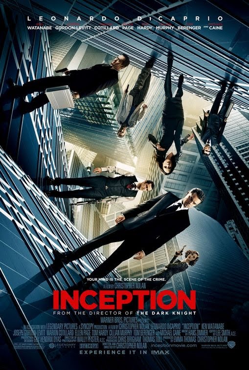
Poster one

Poster two

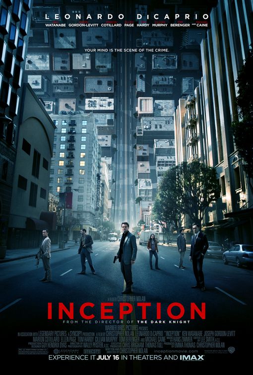
Poster three

In all three posters architecture is the main theme. The tall buildings give the image of the characters being closed in on, a sense of being trapped. The tagline is also recognisable in all three posters "your mind is the scene of the crime". The use of the word "EXPERIENCE" on all three draws the reader in. Also when looking at all three poster we can see in the middle a yellow light this gives me the idea of 'light at the end of the tunnel' that the characters are in trying to work towards something a way out. All three posters seem to have a blue screen over the original image, this is a common theme for Christopher Nolan's films.
The water shown in poster one is known as intertextuality, it seems out of place as though it is supposed to be somewhere else, it seems as though it should be in "The Day After Tomorrow". This poster seems familiar though it looks like the "Dark Knight" poster.


From looking at the inception, and the Dark Knight poster they are clear examples of intertextuality within Warner Brothers posters. This is potentially down to Auteur Theory with both films being directed by Christopher Nolan he has his own personal vision, thematic obsession and a signature style. when looking at all three posters (Inception, Dark Knight and Watchman) it is clear that they are all part of the Warner Bros production company. They all show the vast, wet cityscape. The figures (Cobb- Leonardo DiCaprio, The Joker- Heath Ledger Watchman-Jackie Earle Haley ) have their back to us, palming a weapon.


The Matrix poster is also another clear example of intertextuality, the 1999 "The Matrix" film poster shares a strong resemblance to the Inception poster. In both posters the characters are engulfed by the buildings, and both are emphasized by the vertical feature behind the characters, for the Matrix poster the beam of light and the Inception poster the road is shown as a curling wave.
I then looked at the Magazine fount covers.


Looking at both magazine covers as like the posters they have Incorporated the architecture as the main theme to their covers. Total film have gone that step further by changing the font "FILM" into buildings. Empire have given a birds eye view of the buildings. Although when you look at the Total Film cover it seems to be visually better the image of Leonardo Discaprio is of a higher standard on Empire's cover. When looking at Total Films image it is the same image as the poster where the characters are at different angles, (poster three) the image seems as though it has just been lifted onto the cover with a gun been photoshoped in.